
SII
OVERVIEW
Goal
Create a sleek and modern vertically mounted ultrasound device user experience that leverages on the strengths of its predecessor.
Background
SonoSite’s S-series mounted ultrasound systems were launched in 2007. Over the years the S systems gathered many fans for its simplistic form design and presence of easy to register physical controls such as knobs and buttons. However usability feedback suggested that the device’s digital information architecture was confusing and tedious. For another 6 years there would be no updated version of this popular form factor.
Problems
A confusing menu structure with deep navigation
Not having immediate access to important controls
MY ROLE
I was responsible for the experience strategy and design of the digital UI of the ultrasound system. I led the UX design effort, created all major design deliverables and was involved in evaluating the design solutions throughout the project.
I worked very closely with:
Product management to define and fulfill product requirements.
Industrial design to be cohesive with the physical form design and physical controls for the system.
Software development on iterative design solution implementation.
PROCESS
Research
Since the previous generation S series systems had been on the market for a long time we used field data, salesforce data, insights gathered from customer visits and in-house clinical expert feedback as our foundational research.
However our data also showed that S series users appreciated having physical controls to have precise control over what they were adjusting. Based on this insight the product, clinical experts and design teams decided to double on the physical controls. More explained on this in the design section.


DESIGN
Constraints and Assumptions
As I mentioned earlier we had some strong insights based on the years of use on the predecessor product. We made some key decisions based on these insights:
Make the system all touch for easy cleaning and eliminating crevices were crud could collect.
Replicate the permanence of physical buttons with persistent touch buttons for those controls that users might need immediate access to.
Keep the physical knobs to leverage the precise control knobs offer.
Divide the UI into two main categories :
The Ultrasound UI which contained the Ultrasound image and other digital UI elements
The Persistent Touch UI which contained the knobs, the buttons and a touchpad
Ultrasound Touch UI
For the Ultrasound UI I had a limited area of the screen available for the digital UI controls, since majority of the image is occupied by the ultrasound image.
Persistent Touch UI
I worked closely with clinical experts, industrial designers, mechanical engineers, software engineers and human factors engineers in defining the behavior and states of the Persistent UI controls.
Information architecture
Goals:
Reducing deep navigation
Make controls easily accessible
Make controls easily identifiable
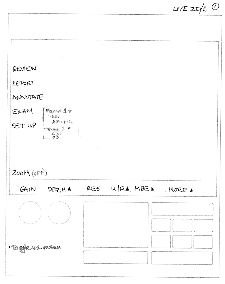
I started out with re-evaluating the information architecture of the previous generation product. My goal was to maintain some cohesiveness but remove the deep, multi-level navigation. Moving many of the immediate access controls into the persistent UI portion of the system helped in freeing up some much needed space in the Image UI.
I then categorized the remaining UI elements into buckets of similar functions, all navigation elements, image adjusting controls together. I then created dedicated areas within the UI for these buckets so that I could create pockets of similar functions, so as reduce confusion in the user’s mind.

I undertook another meta information architecture effort. The ultrasound system has different image adjusting controls for different states of the system. I prioritized the controls so that the most important ones were always at the first level. I constrained myself to only allow the controls to extend by one more page only and no more deeper than that. I created maps of all image controls for each state, worked with clinical experts to get inputs on hierarchy and employed ubiquitous UI patterns for each of those controls.
Sketches and Wireframes


Design Evaluations
In spite of the tight timeline allocated to the next generation of the S series product I incorporated multiple usability tests to validate my design decisions. I worked very closely with human factors engineers and the in-house clinical experts to receive constant feedback.
I shared the load in doing usability and formative testing, scripting test protocols and tag teaming on running usability studies. For the final summative evaluations I supported them with all the needed inputs and infrastructure to help them perform a successful summative evaluation.
LAUNCH and IMPACT
SII won the Design Excellence Award by IDSA in 2016
From post launch surveys I found that the customers greatly appreciated having a flat architecture, identifiable functional groupings, the retention of the physical knobs and the addition of a touch screen.
Addressing all these user experience opportunities and the new sleek form factor has made SII our customer's new favorite device, selling around 2000 devices in just the last year.
ITERATIONS and OPPORTUNITIES
Replicating the control layout from our laptop style systems into this capacitive touch version especially around the trackpad could have created a cohesive cross platform experience. But due to hardware limitation we could not execute on this aspiration.
Due to schedule constraints the Patient data entry screen and Settings screen's could not be addressed.